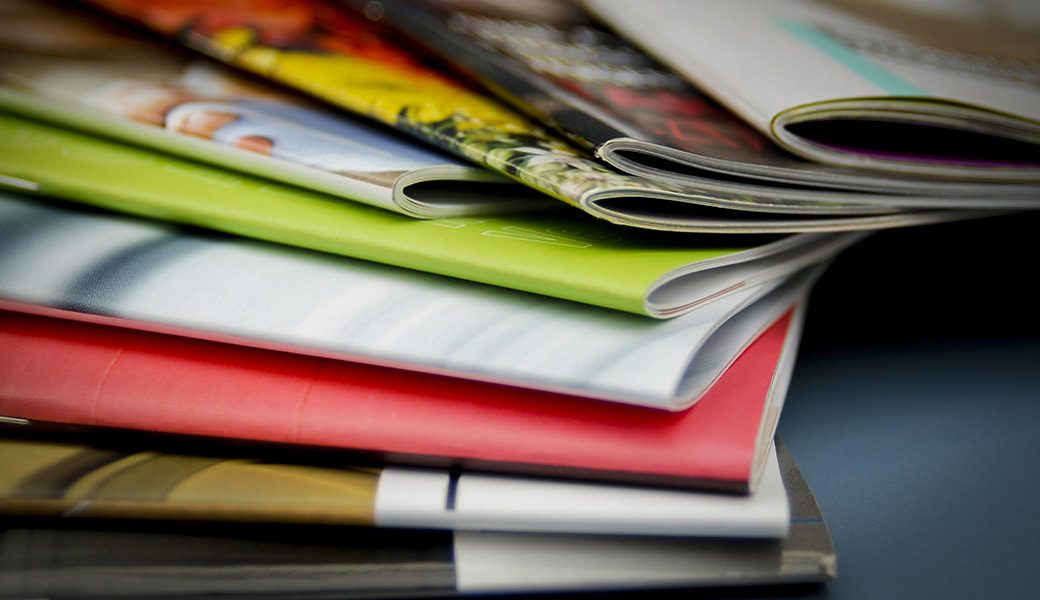
Looking for ways to make your brochure design stand out? A high-quality brochure can be one of the most effective ways of marketing your business. Not only is it visually pleasing, it also offers tangibility. It can communicate key messages about your products or services and your business. A brochure is a great way to engage your existing and potential customers. It can help them identify with and recognise your brand.
Company brochures are quite versatile. They can be sent out in direct mail campaigns or given to potential customers at networking events. They can be given to new clients at initial client meetings to create a lasting impression.
When you think about a business brochure it is often a catalogue style design. It showcases the range of products available. Whilst this traditional style is great, it can be more effective to design a brochure that sets you apart from your competitors. You need something that makes you more memorable.
Here are a few creative tips to help your brochure stand out and make a long-lasting impression.
Visually Appealing
Good design achieves the perfect balance between colour, typography, and images. It is important to adhere to your brand identity. Where you have identified brand colours and fonts ensure they are used in all your marketing. This applies whether it is print or digital. You will have brand guidelines specifying layout, colours and fonts.
Typography will consist of a heading, subheading, body copy styles and other font specifications. It is important to mention that it is good practice to limit your fonts. Some people believe that using several fonts, or unusual fonts, will help their brochure stand out. They believe it will make more of an impact. In reality, a plethora of fonts can affect readability and look untidy.
As mentioned, your brand guidelines will also identify your brand colours. These should be used in your brochure design to ensure it is consistent with your branding. Using brand colours helps readers identify your brand far easier. Colour psychology can play a big part in the emotions your branding evokes.
When it comes to images it is imperative that they are of the highest quality. You need to ensure consistency with them in their finish and the style of image. Think about what images you may want to include in your brochure. Think about the message you want them to convey. To ensure consistency and quality it is best to arrange a professional photoshoot.
Unusual Designs
The traditional brochure is often A4 portrait but it needn’t be. An unusual shaped brochure can create a talking point. If it is relevant to your business it will help your brochure stand out. This technique is die-cutting. It can add visual interest in your brochure. It often used on front covers, but can be applied anywhere in the brochure.
You will need to give consideration to layout design as well as printing techniques. A good designer and printer will be able to guide you on what is achievable.
Take Stock of Your Paper
While you may not think the type of paper you use will make that much of a difference – trust us it will. The higher quality the paper the better! It will give the feeling of high quality and make a longer lasting impression on the recipient. It is important to consider which paper finishes you would like to use in the design stage. This is to ensure your design works well on your selected finish.
Blackberry have over 25 years experience of print. We know print inside out. We have the experience to recommend the right print solution. If you have any questions about brochure design or printing, get in touch on 01527 517309 or fill in our contact form