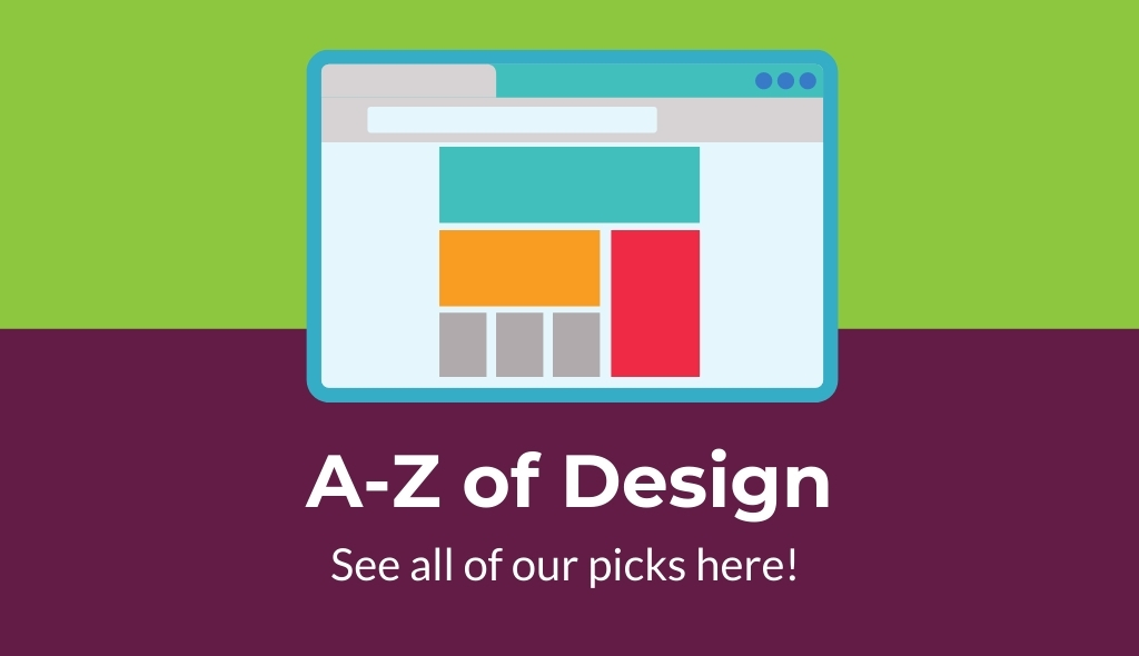
Here at Blackberry Design we use so many design techniques every day which comes naturally to us, just like breathing. We decided to have a little fun and come up with the Blackberry Design A – Z of design. These are just our picks as there are many more to choose from.
A – Arrangement
The arrangement of a document can be the deciding factor between an amazing piece of work that will grab your clients’ interest and eye or a document no one will ever see or even want to attempt to look at.
B – Bold
We have all been there, loading up a web page with our eyes instantly fixated on the bold content of the page. The key is to make sure you select the right areas to make Bold. Using bold is something everyone can do but great designers have the expertise to do it.
C – Colour
Colour is one of the most obvious design tips on our list. Imagine seeing Mcdonalds in a different colour to the infamous Red and Yellow or Facebook in pink rather than their blue, would they be so easily recognisable. Using the correct colour pallet holds your brand together, keeping your identity with your clients and the rest of the world.
D – Design
Design is essentially the most important on the list. Design is the baseline of everything we do. We all make unconscious and conscious decisions based on the design we are looking at, quite often without realising we are doing so. If your design is not professional and on point, this could cost you valuable customers.
E – Effect
The effect is the result of the design. Having the right effect on the viewer is key to getting the correct result whether this is sales or interactions. Having the wrong effect on your viewer can do more than just put them off what they are seeing, it can damage your brand.
F – Framework
A design framework is a visual structure that helps arrange the information and flag potential problems so you can work on it effectively. Frameworks allow anyone that comes across a problem to be able to work through it without using a large amount of time up.
G – Goal
Goals should always be set so everyone involved in a project knows where the tasks are heading. This is especially important in design as if no goals are set or understood the final result of the project may not be what a client requested.
H – Harmony
Harmony may be an unexpected one to see on this list, but harmony is actually the sense that all of the information and elements fit together. This could be in a specific style, theme or mood, with letters, numbers, shapes, icons to hold the whole design together.
I – Ideas
Without ideas, we would never be able to start a project. Conceptualising ideas of what elements and colours work best together or on a larger scale an idea that will make your work stand out from everyone’s else. All of this comes from the creative mind of the designer.
J – Judgment
A design needs to have been lead with good judgment so the result achieves its goal. If a design doesn’t have good judgement the wrong message could be portrayed.
K – Knowledge
Knowledge leads to better designs and understanding trends, colours, layouts, typography and other aspects will help keep a design up to date and fitting in with the times, as well as being able to stand out from other designs out there.
L – Leading
Leading or also known as line-height to developers is the distance between adjacent lines of text. Leading means that a designer can save on space in a document to fit more content in or spread content out so there is less blank space. Leading can be easy to read and follow as well as make smaller text larger helping to improve the legibility.
M – Meaning
Getting the correct meaning across to your viewer should always be a top priority. The meaning of the design with the goal of the design, whether that be sales, views, visits. If the wrong meaning is given it can lead to failure of the design.
N – Numbers
Where would we be without numbers, they have a larger impact on design that you may not even notice. Something as simple as page number placement and style on a catalogue or brochure can have a large impact on the overall design and functionality.
O – Objective
The objective is similar to the goal of a design but can be viewed in smaller sections. Like the objectives for the day, what needs to be finished or setting objective milestones for the future.
P – Pictures
Pictures can bring engagement to a design, showing places that a viewer might what to visit, showing off designs, products or lifestyles. Pictures can convey a message in a matter of seconds that a document of text couldn’t.
Q – Quality
Quality can be viewed in two ways, it can be seen as the level of quality or the physical quality, both are very important and have a massive impact on how the viewer will see the work.
R – Reflection
Reflection comes at the very end of the design process. Reflecting on the design that has been completed can shed light on what else could have been done or address areas for improvement, all of this meaning your next design could be even better than the last.
S – Sketch
Before putting a design together in photoshop, InDesign or other design packages sketching out a design should be the initial part of the process. Sketching is a good way to conceptualise designs and can be quicker to do a view rough sketch before producing it on a computer.
T – Typeface
Typefaces on a basic level are the fonts and font styles that are used in any design. Using the correct typeface is important to the design as it adds to the meaning of the work.
U – Usefulness
Is your design useful? Does it convey what it is meant to? These are just two questions that a designer will ask themselves when they are creating the design. If the design doesn’t achieve its goal it won’t be useful.
V – Vision
The vision of a design is visualised at the beginning. The designer pictures the result and look and how they are going to get there. A designer will need to have a vision of the project, or the final result may not be up to scratch.
W – Work
Hard work is what gets it all done at the end of the day. Having great ideas, vision and everything else on this list is great but without the hard work, the design will never be completed.
X – eXcellent
Okay, we admit it excellent definitely doesn’t start with an X, we couldn’t find any design term that starts with X. But excellent work is definitely key to a good design so we thought we would add it in. Can you think of any design terms that start with X?
Y – Yellow
Yellow is one of the colours of CMYK (cyan, magenta, yellow, and black) that is used in four-colour process inks. The CMYK colour is used when designing for printing work as RGB doesn’t translate to print.
Z – Zoom
Zoom is a big tool that all designers should use to make sure they get their designs pixel perfect. Without the zoom tool, small adjustments wouldn’t be able to be made. Small adjustments don’t sound like a lot but enough small adjustments can turn a good design piece into a great design piece.
Everything on this list, designers consciously and unconsciously do when creating their masterpieces. Next time you undertake some design work think and see how many of these you did.